Creative Spotlight: Quaker Oats

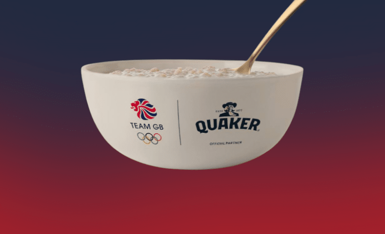
It’s quite a bold move to describe a product as ugly in advertising, but in the case of Quaker Oats it really works. November’s creative spotlight is for Quaker, with a series promoting its sponsorship of Team GB.
One ad features Linda, proud mum of British weightlifter Emily Campbell, who explains that despite porridge looking “flipping ugly” it’s the stuff that fuels the athletes. Another points to all the ugly moments that make a great athlete. The 5am alarms, the blisters, and mountains of sweaty laundry. All fuelled by Quaker Oats. Deliciously ugly.
Based on the nutritional value of porridge, Team GB’s rowing team has a motivational motto: Oats move boats. So for this one, our favourite, we’re given a romp through a play on words for other athletes. Quaker sachets move bob sleighs; ugly bowl forward roll (one for the gymnasts); and the world’s your stage when you eat some beige. Its silliness makes the ad stand out and gets the message across in a charming way.
It could have been a cliché about having a warm bowl of porridge, drizzled in honey to warm you from your toes to your nose, but no Quaker have gone real. Ugly real.
Creative agency: Uncommon Creative Studio


